Browsing & Searching Cards
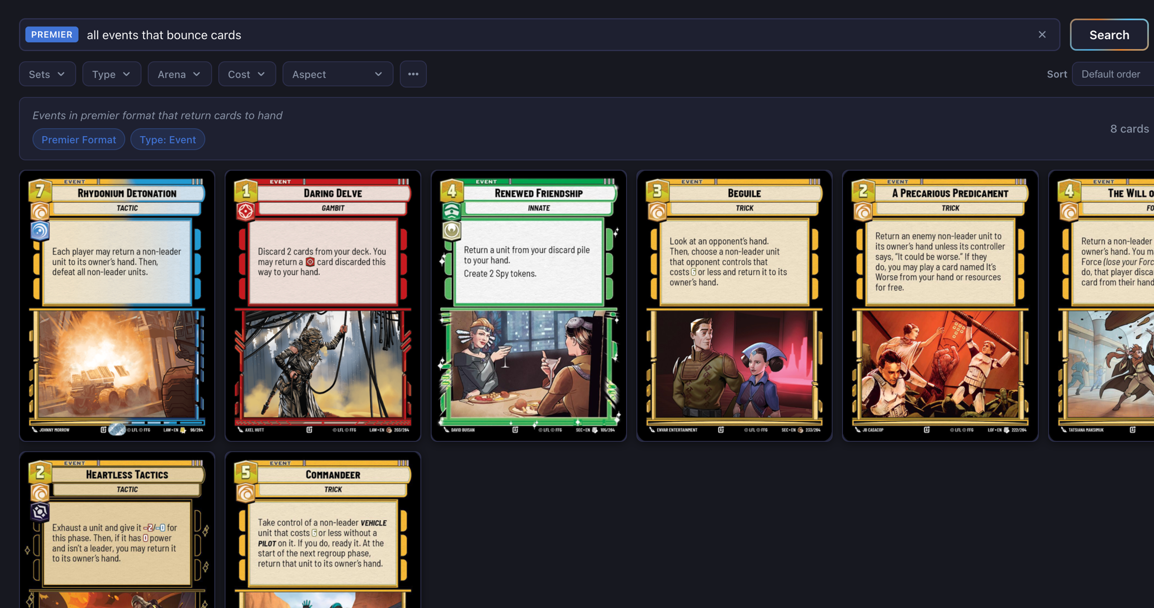
Search Bar
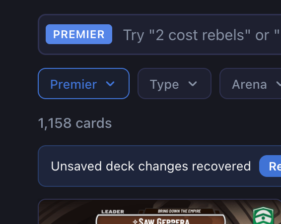
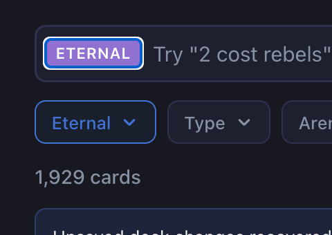
Format Toggle
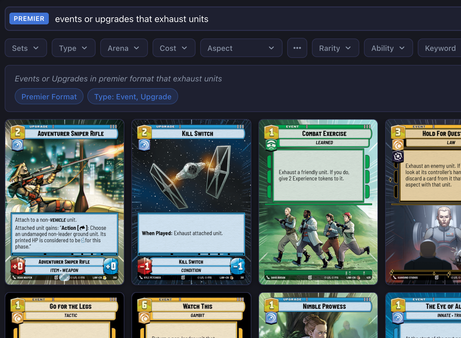
Natural Language Search
Clearing Search
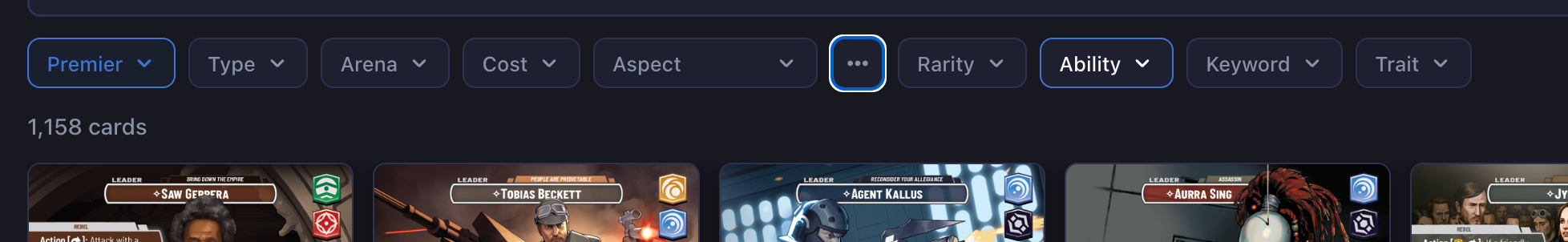
Manual Filters
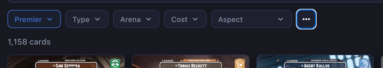
Sets
Type
Arena
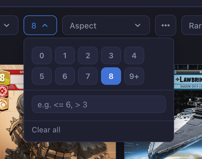
Cost
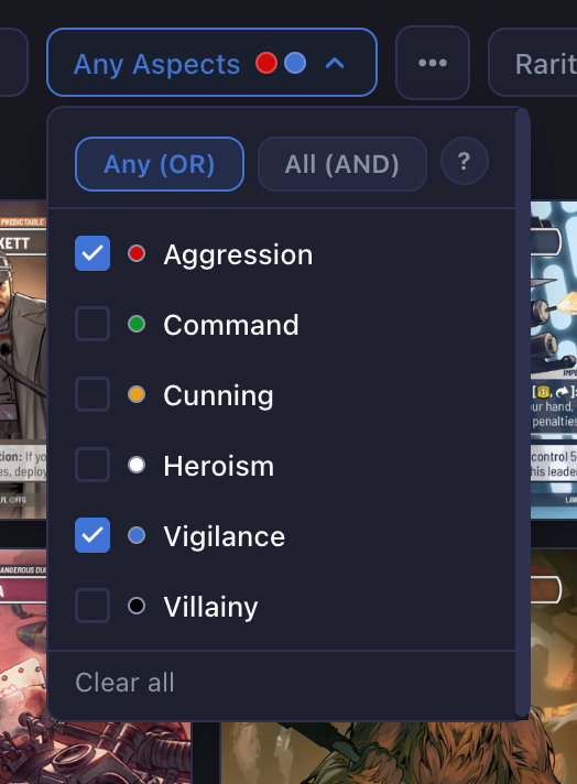
Aspects
More Filters
Filter Chips
View Controls
Sort
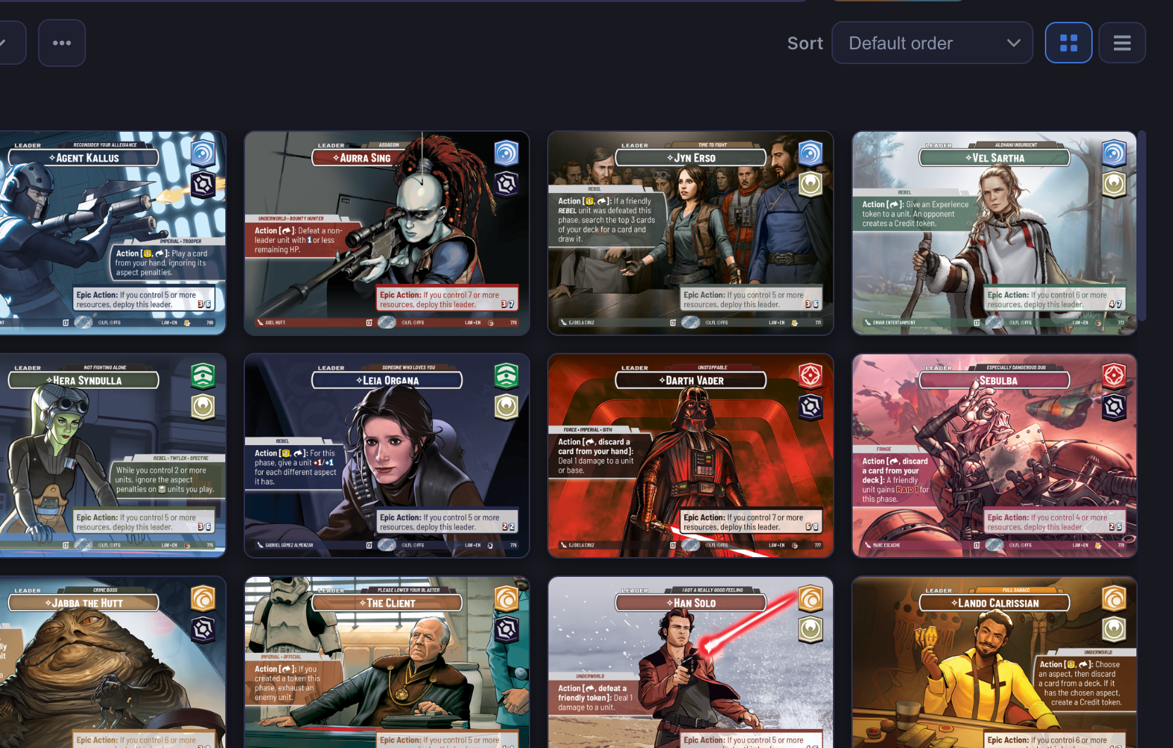
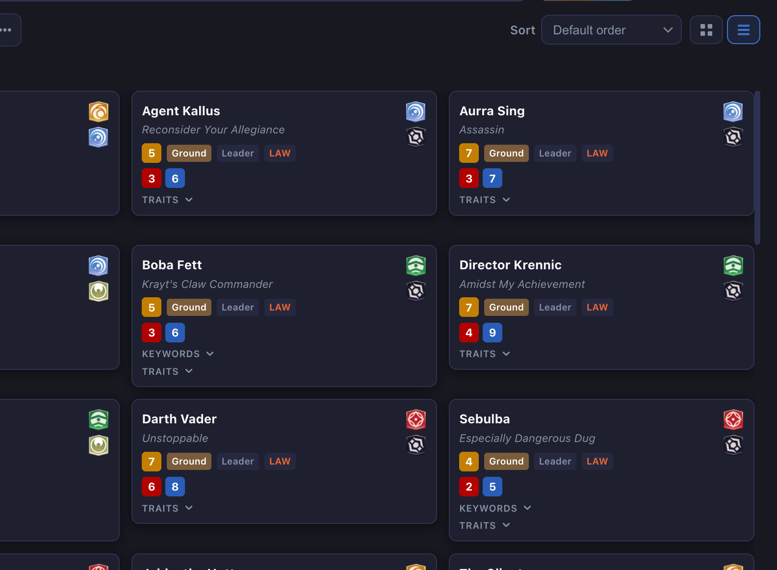
View Mode
Card Interactions
Hover Popover
Flip Button
Detail Link
Pagination
Last updated